Shape lessons for lovable characters · sketch one today
Mascot making · lesson track

Brand Buddies and Team Mascots

A character can be anything. A mascot has a job. It has to welcome visitors, cheer a stadium, explain an app or make a town feel proud, and it has to do that on a billboard, a sticker, a sock and sometimes inside a two-metre foam costume.

That job is your design brief. Before you draw a single circle, write down who the mascot speaks to, where it will appear and the one feeling it should leave behind. Then let the classics below show you how shape follows purpose.
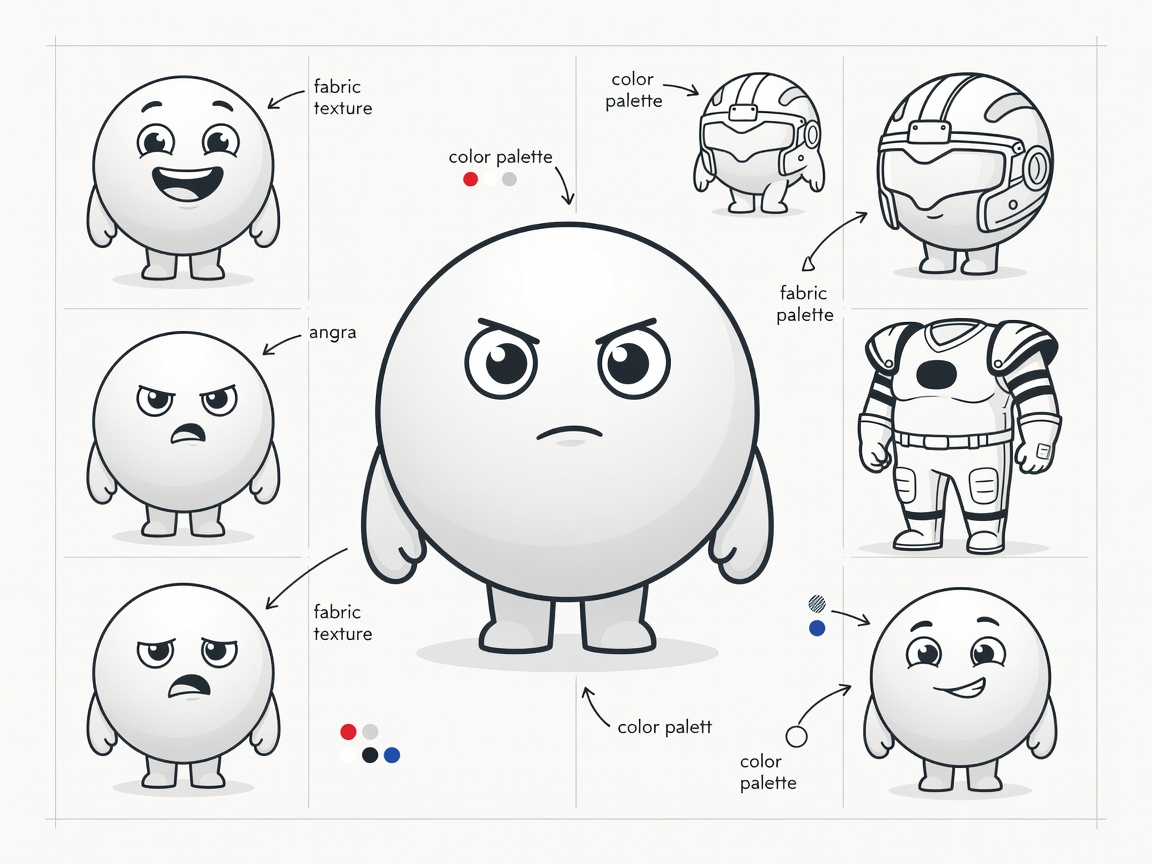
Flat vector sketch sheet of a round team mascot with expression studies, colour notes and costume measurements
Brief first

The three-line mascot brief

  1. Audience: who meets this mascot first? Kids, commuters, gamers, fans?
  2. Touchpoints: list every place it appears, from favicon to parade float.
  3. One feeling: choose a single word, such as “welcome”, “brave” or “silly”, and test every sketch against it.

Pin the brief above your desk. When you are stuck between two versions, the brief decides.

Brand veterans

Bibendum and the repeated shape

Michelin's Bibendum appeared in 1898, drawn by the cartoonist O'Galop from a stack of tyres. The trick is repetition: one shape, the ring, builds the entire body. Over the decades the rings slimmed and the face softened, but the construction never changed, so the mascot stayed recognisable for more than a century.

Lesson: find one shape that belongs to the brand (a drop, a leaf, a cog) and build your mascot from it.

Regional ambassadors

Kumamon and the yuru-chara wave

Japan's yuru-chara, or “loose characters”, are relaxed local mascots promoting towns and prefectures. Kumamon, created for Kumamoto Prefecture in 2010, is the superstar: a black round bear with circular red cheeks and wide eyes.

Its genius is restraint. Two colours and simple circles make it easy to print, easy to draw and easy to license, which helped it appear on countless local products.

Event mascots

From Waldi to Miraitowa

Waldi, the striped dachshund of the Munich 1972 Summer Olympics, was the first official Olympic mascot. Its colourful bands echoed the Games' graphic identity, a reminder that event mascots must match the wider visual system.

For Tokyo 2020, schoolchildren across Japan voted for the winning pair, Miraitowa and Someity, designed by illustrator Ryo Taniguchi. Their checkered pattern links directly to the Games emblem.

Team mascots

Gritty, Phillie Phanatic and big energy

Sports mascots live in costume and in motion. The Phillie Phanatic, introduced by the Philadelphia Phillies in 1978, and the Flyers' Gritty, launched in 2018, both rely on chunky shapes, huge eyes and a strong colour that reads from the top row of a stadium.

Gritty also proves cute is optional. A mascot can be weird, as long as the silhouette is bold and the personality never wavers.

App helpers

The Duolingo owl effect

Digital products use mascots to soften instructions and nudges. Duolingo's green owl, Duo, is built from rounded geometric shapes that animate cleanly and scale down to a notification icon.

If your mascot will be animated, design joints and expressions early: a body made from simple primitives is far easier to rig than an intricate drawing.

Costume reality check

Designing for foam and fabric

If the mascot may become a walk-around costume, think like a costume maker. Oversized heads need room for a performer's sightline, usually through the mouth or a mesh panel. Thin limbs, floating parts and fine patterns rarely survive production. Big shapes, few colours and soft edges do.

Checklist

Before you hand it over

  1. Works in one colour (for stamps and embroidery).
  2. Readable at 32 px as an icon.
  3. Has at least five expressions and three poses.
  4. Comes with a turnaround and colour codes.
  5. Is fully original, with no borrowed trademarked features.

Next up: turn those expressions into a sticker pack.