Shape lessons for lovable characters · sketch one today
Shape & colour · lesson track

Silhouettes and Palettes That Charm

Shape tells people who your character is. Colour tells them how to feel about it. Get both right and a mascot charms in under a second, long before anyone notices line quality or texture.

This page is your desk reference: the shape vocabulary, the silhouette test, value contrast, and a stack of friendly palettes with hex codes you can drop straight into your drawing app.

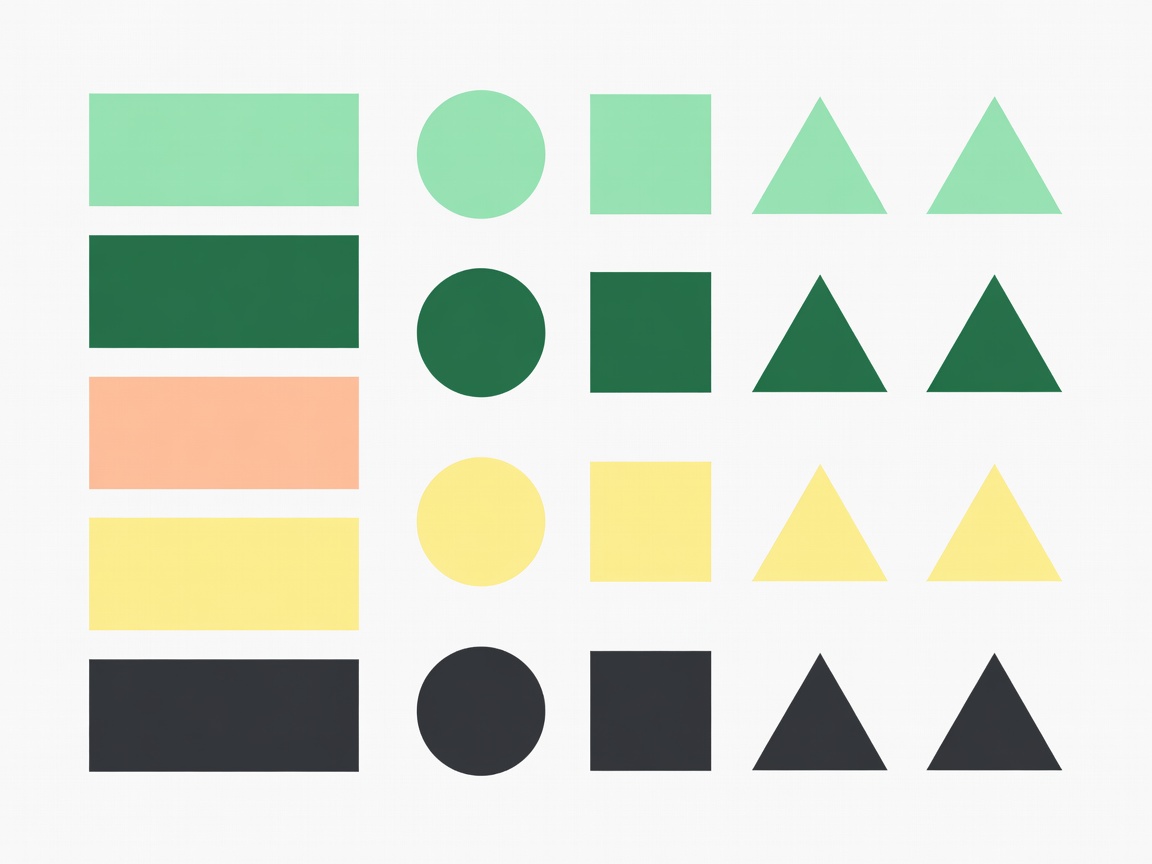
Flat vector palette swatch board with mint, deep green, peach, butter yellow and charcoal colour chips beside shape studies
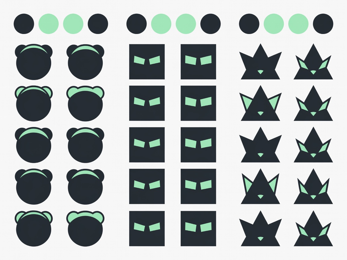
Flat vector shape study sheet comparing round, square and triangular mascot heads in charcoal and mintShape language

Circle, square, triangle

Circles feel soft, safe and playful. Squares feel stable, trustworthy and strong. Triangles feel dynamic, sharp or mischievous. Most charming characters are about 70% circle, with small square or triangle accents to add personality.

Silhouette test

Fill it black

  1. Duplicate your finished character.
  2. Fill every shape solid black.
  3. Shrink it to the size of a fingernail.
  4. Ask a friend who it is and what it is doing.

If the answer is “a lump”, push the outline: bigger ears, a clear gap between arm and body, a distinctive tail or tuft. Pikachu's zig-zag tail and black-tipped ears are a textbook example of silhouette-first design.

Palette 01

Garden Friend

#86EFACmain 60%
#FFF7EDbelly 30%
#FDA4AFcheeks 10%
#1F2937eyes & line

Fresh, gentle and kid-friendly. Great for wellness and nature brands.

Palette 02

Toasty Bun

#FDBA74main
#FDE68Ahighlight
#FB7185accent
#1F2937eyes & line

Warm and snackable. Perfect for food, cafés and cosy stickers.

Palette 03

Moss & Lilac

#A7C4A0main
#D8B4FEaccent
#FFF7EDface
#14532Dline

Dreamy and calm, a lovely fit for sleepy or magical characters.

Palette 04

Studio Mint

#14532Dmain
#86EFAClight
#FDE68Aspark
#FFF7EDeyes

Bold and confident for sports teams or tech helpers.

Rule of thumb

60 · 30 · 10

Borrowed from interior design, the 60-30-10 rule keeps palettes balanced: one dominant colour for the body, a secondary for belly, face or clothing, and a small accent for cheeks, a scarf or a gem. Add your dark anchor for eyes and outlines on top.

Hello Kitty, created by Yuko Shimizu for Sanrio in 1974, is a masterclass: white body, a red bow, black eyes and a yellow nose. Four colours, instant recognition.

Value & access

Contrast before hue

Convert your design to greyscale. If the face disappears into the body, increase the value difference, not the saturation. When your mascot appears next to text, keep that text at a contrast ratio of at least 4.5:1, the WCAG guideline for normal body text.

Colour meanings vary across cultures, so test with your real audience. And keep reference codes in a shared swatch file (or a Pantone match for print) so every artist uses the exact same mint.
Exercise

Three palettes, one mascot

  1. Take your finished line drawing.
  2. Colour it three times using palettes 01, 02 and 03.
  3. Put them side by side and write one word for each mood.

You will be surprised how much the personality shifts with colour alone.